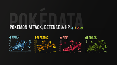
Gotta Plot 'Em All (An R Experiment)
Table of Contents
ABOUT:
Gotta Plot `Em All is a project exploring Pokémon data using bubble plots. The goal of this project was to explore the power of visualizing data and to try creating more interesting plots in R with a fun dataset.
- I Learned How To: use R base functions to create bubble plots, think about data trends, and have some fun with data!
- Next I Want To: learn to plot more complex figures using {ggplot2} in R, and try plotting raincloud plots, as recommended by my statistics professor.
📚 I. Caught ‘Em All (Introduction & Hypothesis)
I have proven what Pokémon nerds have suspected all along: Not all Pokémon are created equal. But exactly how unequal are things in the Pokémon world?
Taking data from this dataset, I decided to make bubble plots to compare Pokémon stats. Bubble plots are scatterplots on steroids. They are interesting because they easily convey information on three dimensions. Besides the normal x-axis and y-axis dimensions, they can also represent data through the size of the point, or bubble.
In the case of Pokémon data, I thought it would be interesting to see whether there was a correlation between the three most basic indicators of a Pokémon’s strength: attack power, defense power, and HP (health points). I predicted that there would be a positive correlation—that is, higher attack stats would predict higher defense stats. A positive correlation would suggest that some Pokémon were created to be overall stronger than other Pokémon.
Furthermore, I decided to split Pokémon by their primary type to see whether trends might be different across different types. (And alright, plotting all 898 Pokémon that exist in the Pokédex would’ve been a bit too much, even by my nerdy standards.)
Now I was ready to plot ‘em all.
💻 II. Pokédata Plotting (Methods)
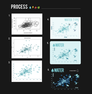
The plot started off as a humble symbols() plot, just the base function in R. I then added colors, labeled each Pokémon on the plot, and adjusted the proportions of the bubbles.
The reason the proportions of the bubbles needed adjusting is because by default, R will want to size the radius of the bubbles by HP. However, making the plot this way will turn the relative proportions of the bubble all wonky. To fix this, I substituted HP for area of the circle. And ta-da! Properly scaled circles.
Here’s a sample of the code used to make the plots:
png("WaterPokemonBubblePlot2.png", width = 10, height = 7, units = 'in', res = 300)
radius <- sqrt( waterpokemon$hp/ pi )

# The bubbleplot
symbols(waterpokemon$attack, waterpokemon$defense,
        circles = radius, inches = 0.4, fg = "#ffffff00",
        bg = "#8fd4d740", main = "",
        cex.main = 2.5,
        ylab = "",
        xlab = "",
        col.lab = "#297b90",
        col.axis = "#297b90",
        col.main = "#297b90",
        ylim=c(7,150),
        xlim=c(5,160),
        yaxs="i",
        xaxs="i",
        axes = FALSE,
        family = '',
        )
box(bty="l", col= "#297b90")
axis(2, col.ticks= "#297b90", col= "#297b90", col.axis = "#297b90",
     family ="Bebas")
axis(1, col.ticks= "#297b90", col= "#297b90", col.axis = "#297b90",
     family ="Bebas")

showtext_begin()
text(waterpokemon$attack, waterpokemon$defense, waterpokemon$name,
     col= "#297b90", cex=2, family ="tw", font = 2)
showtext_end()
dev.off()
Click here to learn about how I installed custom fonts in R!
To get custom fonts "Bebas" and "Titillium Web" into R, I used the `{showtext}` & `{extrafont}` packages. ``` # Import custom fonts -------------------------- library("extrafont") font.import() loadfonts() fonts() #view available fonts library(showtext) font.add("tw", "Titillium Web.ttf") font.add.google("Titillium Web", "tw") ```📊 III. Pokédata Insights (Results & Discussion)
So were there any trends? Is there a terrible inequality to be found in the Pokémon world? Let’s take a closer look, shall we?
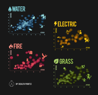
Here all my plots:
💦 Water Pokémon Insights
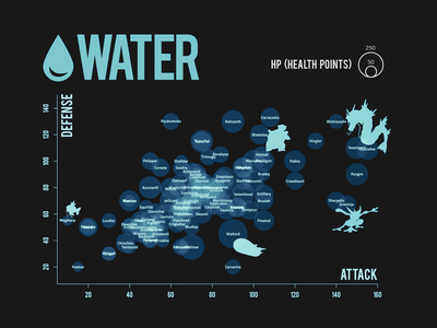
- Water Pokémon seem to follow a fairly strong positive correlation between attack and defense stats. Unsurprisingly, Pokémon like Gyrados and Swampert who are known to be powerful attackers, are also strong defenders.
- A notable outlier is Pyukumuku, a newly introduced Pokémon from Generation 7 that has average attack stats, but ranks in the top percent of defensive Pokémon! What a curious fellow.
- In terms of HP, it doesn’t come as a surprise that Wailord has the biggest bubble. At 14.5m tall, it’s the largest Pokémon found so far in the Pokémon world, so it makes sense that it has the resources to withstand damage.
- Magikarp is another Pokémon to note. Although beloved by some, Magikarp is one of the most ridiculed Pokémon not only for it’s dopey expression, but also because this Pokémon is laughably weak (anyone who plays Pokémon interally groans when they encounter a Magikarp…they’re not even worth battling.) However, it looks like Magikarp is not really the weakest Pokémon around and doesn’t deserve the disrespect. As the name suggests, Feebas is the feeblest Pokémon of ‘em all, having both defensive and attack stats of less than 20!
⚡ Electric Pokémon Insights
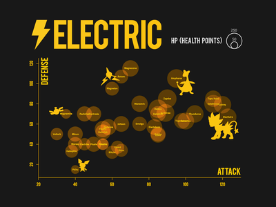
Electric-type Pokémon seem to be less tightly correlated in Defense and Attack compared to other types. One reason for this may be due to the sample size; there are relatively few electric-type Pokémon compared to other types ((only 61! compared to 144 water-types).
One interesting finding, is that Pichu (the pre-evolution of the very beloved Pikachu), has the lowest defense stats of any Pokémon graphed here!
🔥 Fire Pokémon Insights
🍃 Grass Pokémon Insights
💭 IV. Closing Thoughts (Conclusions)
One limitation of this small project was that I didn’t have fine control over some aspects of the plot, such as the labels (which sometimes overlapped and created a cluttered, hard-to-read plot). I had to cheat a little to fix other things about the design in photoshop.
That said, the goals of this project were to learn how to create bubble plots in R using base functions and to dip my toes into data visualization while having some fun! Indeed, I learned a lot about using the R base functions to plot. Next, I think I will explore more advanced data visualization using packages like ggplot2 to have more control over the visual components and geoms of the plot. Perhaps I’ll get good enough to drop the Photoshop from the design process!
View the full project showcase here!